

How To Choose Your Wedding Colors From A Photographer’s Perspective
In this guide, we’ll explore essential tips for selecting the perfect wedding colors that resonate with your personal style and the ambiance you wish to create. Understanding how colors interact with each other, and the emotions they evoke, can help you make informed decisions that will enhance your special day.
Choosing your wedding colors is one of the first creative decisions you’ll make—and one of the ones that quietly influences everything that follows. Your florals, linens, attire, stationery, and overall mood all stem from this choice. And while personal style always comes first, there’s something many couples don’t realize until later: some colors simply photograph better than others.
As someone who has photographed weddings for over 17 years, I’ve seen firsthand how color choices translate on camera—and how they can elevate your photos from beautiful to truly timeless.

Start With the Feeling You Want Your Wedding to Have
Consider the atmosphere you wish to create. For instance, if you want a cozy and intimate gathering, warm tones like deep reds and soft golds can enhance that feeling. On the other hand, if your vision is for a bright and cheerful celebration, vibrant hues like sunny yellows and lively corals can elevate the mood.
Before you think about specific colors, think about emotion.
Do you want your wedding to feel soft and romantic? Moody and dramatic? Light and airy? Classic and timeless?
Let your choice of wedding colors reflect your unique love story. For example, if you and your partner share a love for the ocean, colors inspired by the seaside—such as soft blues, sandy beiges, and seafoam greens—can beautifully encapsulate that connection.
Color is emotional. Pastels tend to feel gentle and romantic. Jewel tones feel rich and intentional. Bright primary colors feel energetic and bold. None of these are “wrong,” but they do photograph very differently.
If your goal is beautiful wedding photos that feel elegant, cohesive, and timeless years from now, color choice matters more than you might expect.
Colors That Photograph Beautifully
Additionally, consider how these colors will affect your overall wedding theme. If you are going for a rustic vibe, colors like sage green and dusty rose can complement wooden elements and natural textures beautifully, creating a harmonious look.
Certain colors consistently photograph well because they work harmoniously with natural light, skin tones, and the environment around you.
Light blues are one of the most universally flattering colors in wedding photography. They reflect light softly, complement nearly every skin tone, and work beautifully in both indoor and outdoor settings. They’re especially stunning for spring, summer, and waterfront weddings.
Utilizing light blues throughout your decor, such as table linens, bridesmaid dresses, and floral arrangements, can create a cohesive look that not only photographs well but also resonates with a soft elegance, enhancing the romantic feel of your wedding.
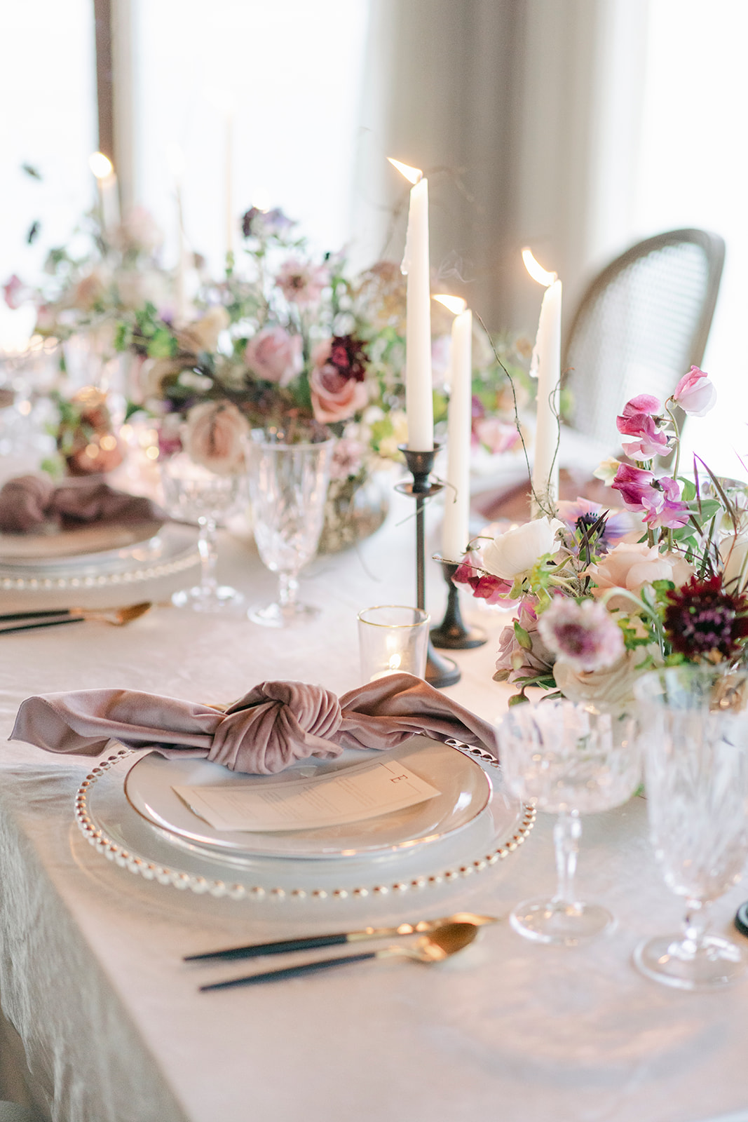
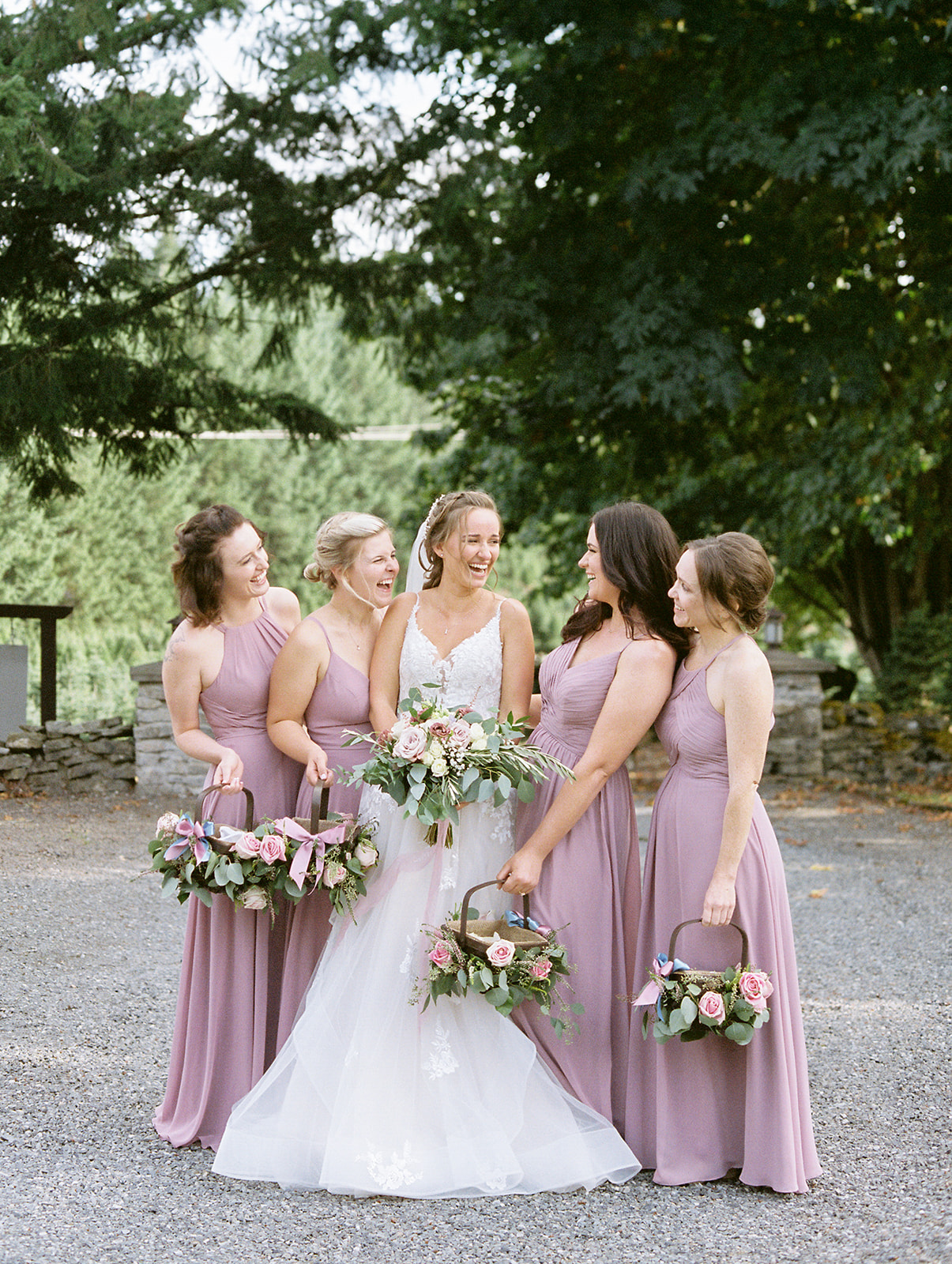
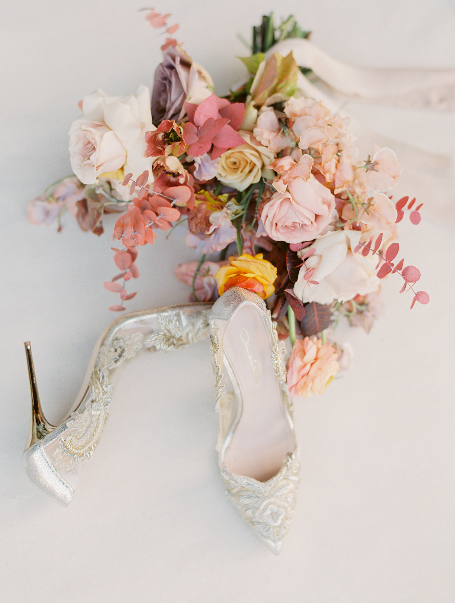
Blush pinks are a longtime favorite for a reason. Soft blush tones feel romantic, flattering, and timeless without overpowering a scene. They pair beautifully with neutrals, greenery, and metallic accents and translate incredibly well on camera.
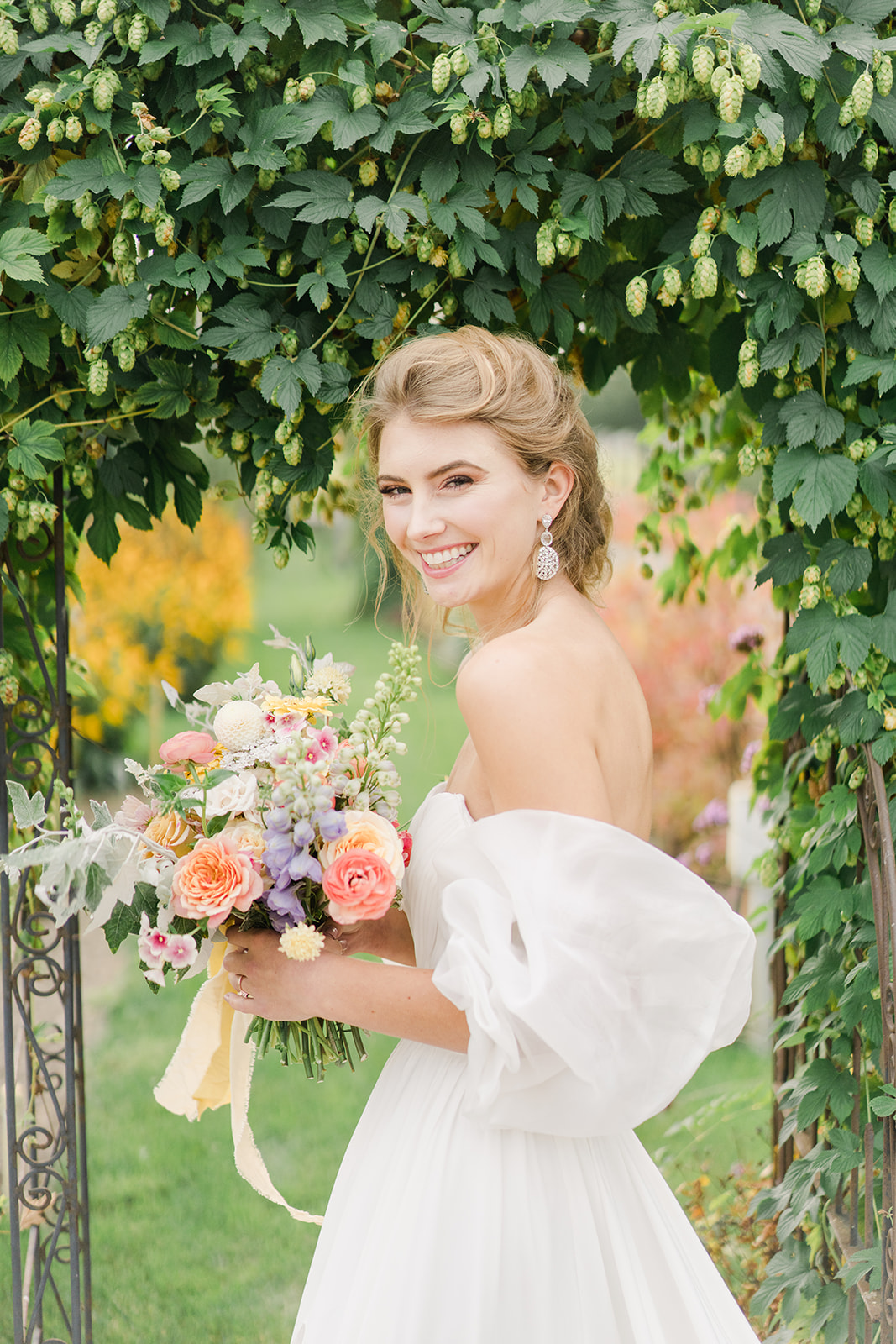
Peach tones bring warmth without intensity. Peach photographs softer than bright orange or coral and adds a gentle glow to florals and linens—especially beautiful in natural light.
To illustrate, a peach-themed wedding can feature peach-hued centerpieces, peach rose bouquets, and even peach desserts, tying the theme together while ensuring the palette remains soft and inviting in photographs.
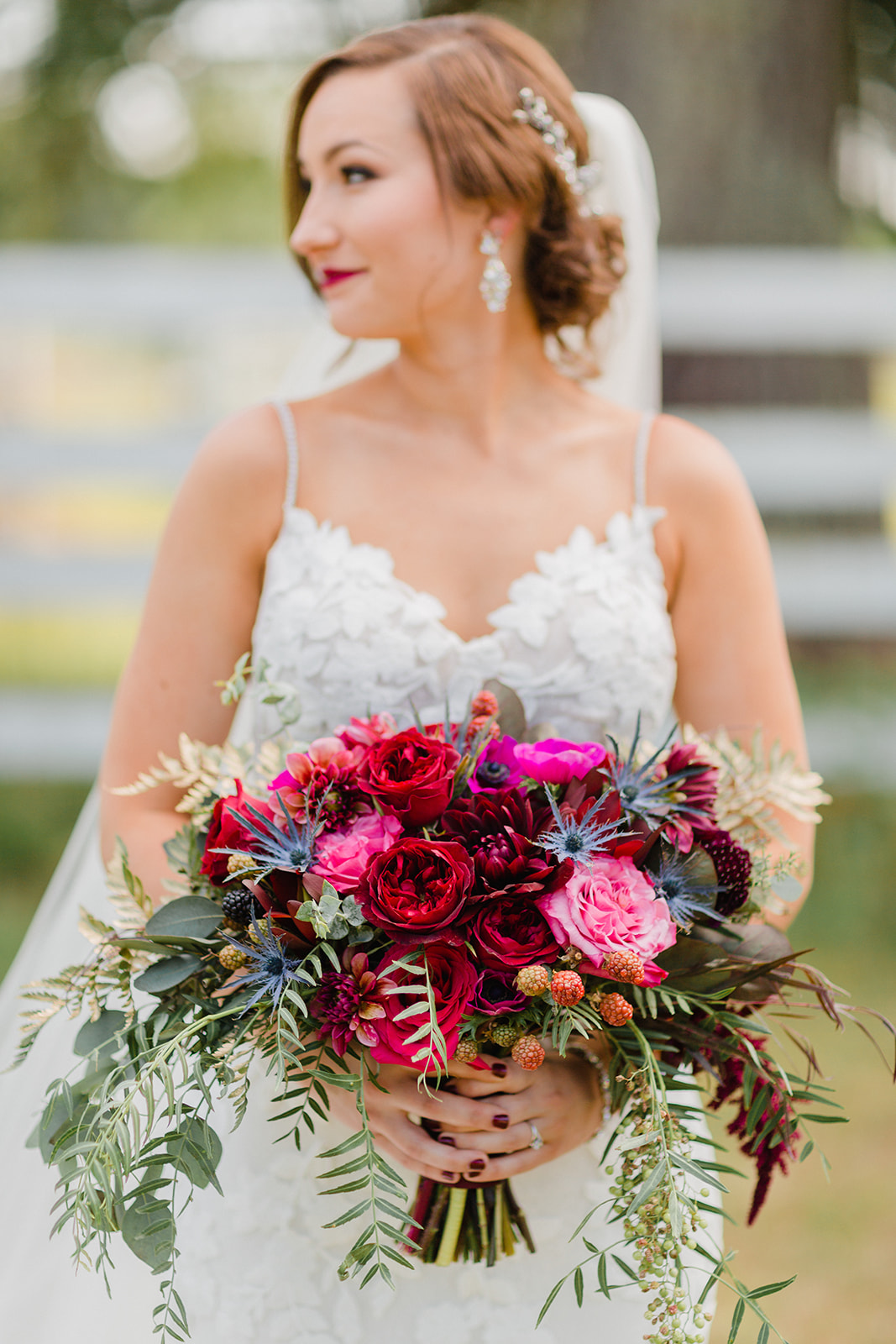
Rich burgundy is one of the best deeper colors you can choose. It offers drama and depth without the harshness that brighter reds can create. Burgundy photographs beautifully in fall and winter weddings and pairs well with blush, ivory, and greenery.
In general, jewel tones and pastels photograph best. They have depth, softness, and richness that translate beautifully through a lens without overwhelming the frame.

Colors That Don’t Photograph as Well
It’s crucial to keep in mind the overall balance of your color choices. For instance, if you decide on brighter colors, consider using them as accents rather than the main theme. This allows for vibrant pops while maintaining a sense of sophistication. For example, a bright red accent in flower arrangements or table settings can create a striking contrast without overwhelming the overall aesthetic.
While every color can be used intentionally, some are more challenging on camera—especially in large doses.
Bright red tends to photograph very strongly and can easily overpower an image. It often pulls attention away from faces and can reflect harsh color casts onto skin tones, especially in close portraits.
Yellow, particularly bright or primary yellow, can also be difficult. It reflects light intensely, can cast unwanted tones onto skin, and often appears more saturated in photos than it does in real life.
Bold primary colors—true red, bright blue, primary yellow—tend to photograph harshly because they lack softness and depth. They can feel visually loud in images and don’t always age as well when you look back at your photos years later.
In contrast to primary colors, softer variations can add depth without taking away from the warmth of your overall color scheme. For instance, using pastel versions of these colors can create a laid-back and inviting atmosphere while still allowing for personal expression.
This doesn’t mean you can’t use these colors at all—but they’re best used sparingly, as small accent details rather than dominant tones.
Think About the Environment and Season
Your venue and season should influence your wedding color palette.
Seasonal elements also play a significant role in color selection. In the fall, for example, rich colors like burnt orange and mustard yellow can enhance the natural beauty of changing leaves, creating an inviting atmosphere as well as a stunning backdrop for photographs.
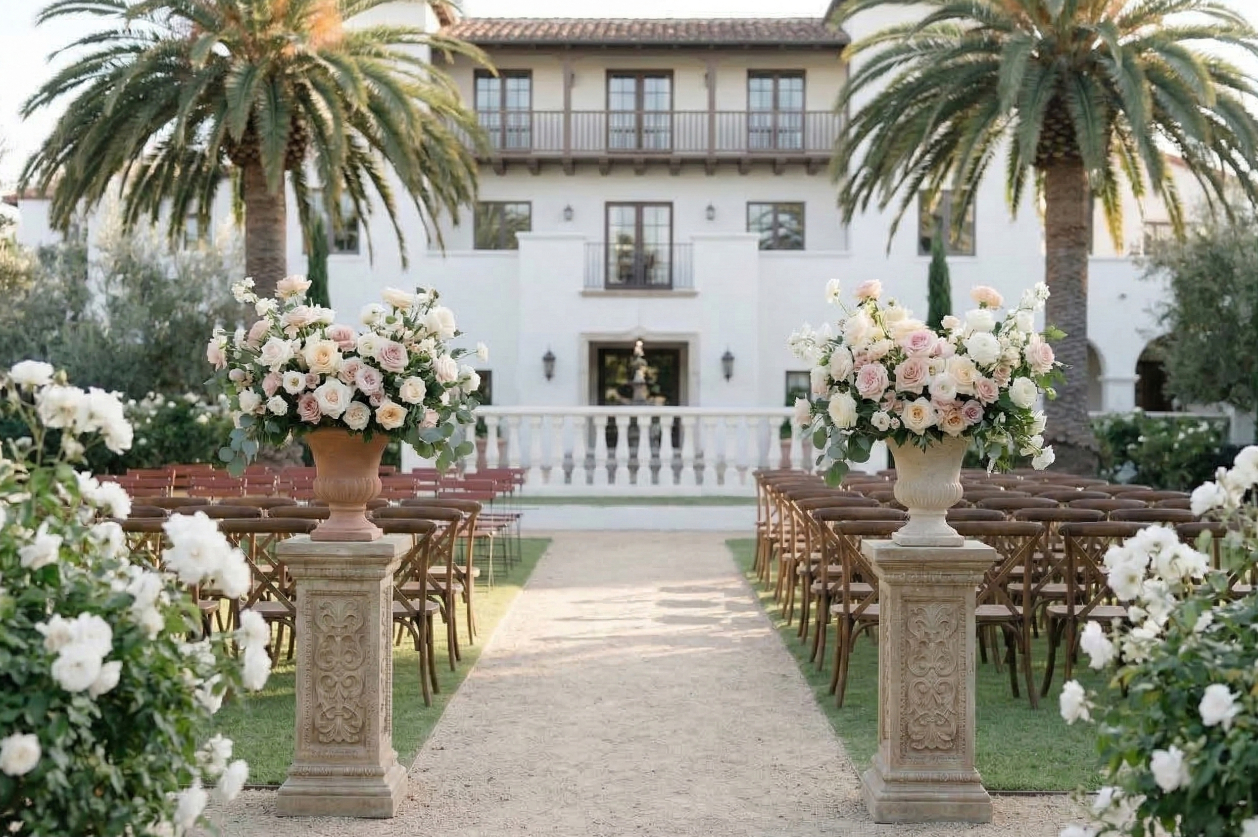
Garden and outdoor weddings pair beautifully with pastels and soft jewel tones.
Barn and rustic venues are elevated by muted neutrals, blush, sage, dusty blue, or burgundy.
Winter weddings shine with deeper jewel tones like emerald, burgundy, or navy paired with soft neutrals.
When your colors work with the environment instead of fighting it, your photos feel more cohesive and effortless.
By selecting colors that harmonize with the natural surroundings, such as deep greens and browns for a forest wedding, you can create a seamless integration of your wedding with the beauty of nature, bringing a sense of tranquility to your celebration.
How to Balance Color Without Overdoing It
Incorporate various shades of your chosen colors to add dimension. Layering different hues of the same color can create a beautiful gradient effect, enhancing the visual interest without creating chaos in your palette.
One of the most elegant approaches to wedding color is restraint.
Choose one or two primary colors, then support them with neutrals like ivory, champagne, taupe, or soft gray. This allows your color palette to breathe and keeps your wedding from feeling overly themed.
Florals are a great place to introduce color naturally, while linens, attire, and décor can remain more neutral. This balance photographs beautifully and keeps the focus where it belongs—on you and the people you love.
Think about how each element of your wedding day can contribute to your color scheme. From the cake to the invitations, let every detail reflect your chosen colors to create an immersive experience for you and your guests.
Final Thoughts on Choosing Wedding Colors
Trends will come and go, but photographs last forever. When choosing your wedding colors, think beyond what looks good on a swatch and consider how those colors will translate in light, in motion, and in emotion.
As you finalize your color palette, consider creating a vision board. This can help you visualize how your colors will work together and ensure that every element from your ceremony to your reception ties back to your original vision.
Soft pastels and rich jewel tones consistently create images that feel timeless, romantic, and elevated. Bright primary colors tend to feel harsher on camera and can distract from the story you’re trying to tell.
Remember, the ultimate goal is to choose wedding colors that not only represent you as a couple but also create a timeless atmosphere that you’ll cherish for years to come. Take your time, explore various combinations, and trust your instincts to help guide your choices.
In summary, the journey of selecting wedding colors is an opportunity to express your personality and set the tone for your celebration. Choosing thoughtfully will ensure your wedding remains a beautiful memory captured in photographs that last a lifetime. Embrace the process, involve your partner’s ideas, and let your creativity shine through this important decision in your wedding planning.


add a comment
+ COMMENTS