

How to Choose Your Wedding Colors That Will Look Amazing in Photos
I get so excited about seeing your wedding colors on your wedding day. I have seen some gorgeous wedding colors and some that are not so photo-friendly, which is why I wanted to write this blog post. Your wedding colors set the tone for your entire celebration—they reflect your personality, style, and season. As a seasoned wedding photographer based in Utah and photographing weddings all over the world, I’ve seen firsthand how the right (or wrong) color palette can affect the overall feel of your photos. If you’re wondering what wedding colors look best on camera, you’re in the right place so keep on reading.
Let’s dive into how to choose a wedding color palette for photography that will not only look beautiful in person but also translate stunningly in your photos for years to come.
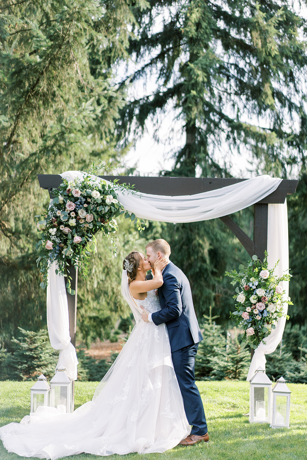
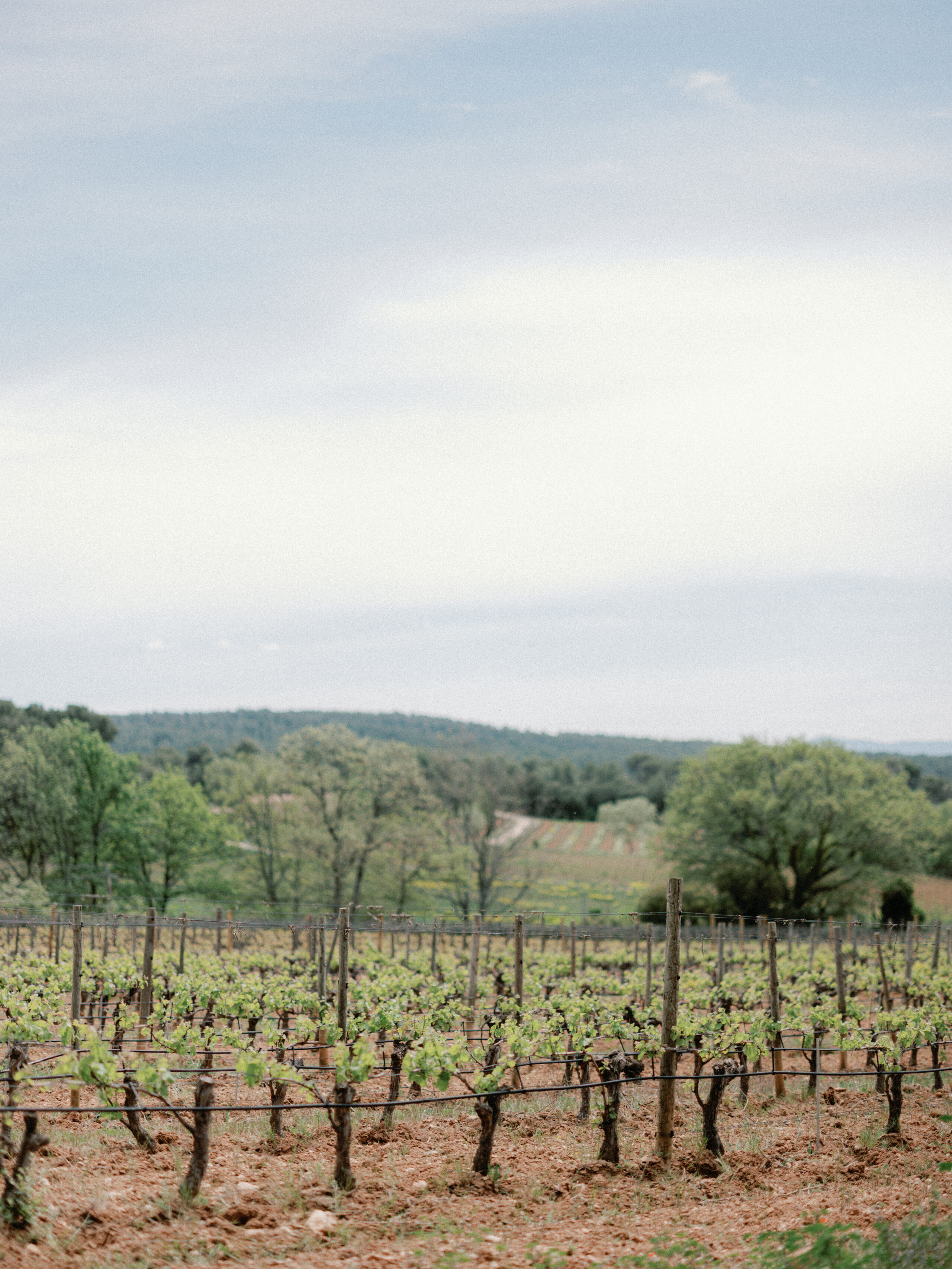
While bold colors can be fun, highly saturated tones (like bright neon green or highlighter yellow) often dominate your images and distract from your faces and the natural beauty of your day. On the other hand, muted and earthy tones photograph beautifully because they allow light to interact softly with fabrics and florals.
Photographs beautifully:
- Dusty blue
- Sage green
- Terracotta
- Soft blush
- Taupe and champagne
Trickier on camera:
- Neon colors
- Harsh reds (can cast color on the skin)
- Bright orange (often oversaturates in digital photography)
2. Consider the Season (But Don’t Be Too Literal)
It’s natural to draw inspiration from the time of year, but don’t feel tied to seasonal stereotypes. Fall doesn’t have to mean pumpkin orange and brown, and winter isn’t only red and green.
Instead, elevate the seasonal feel with modern twists:
- Fall: Rust, copper, deep emerald, and soft mauve
- Winter: Icy blue, silver, plum, and champagne
- Spring: Lavender, pale peach, sage, and cream
- Summer: Soft coral, dusty rose, sky blue, and light neutrals
Seattle Tip: If you’re getting married somewhere like Discovery Park or Chateau Lill, soft, natural colors will harmonize with the greenery and overcast light beautifully.
Utah Tip: At venues like La Caille or Red Butte Garden, blushes, creams, and sage pair beautifully with the natural backdrop. There is already a lot of greenery there, so pick colors that would go well with it.
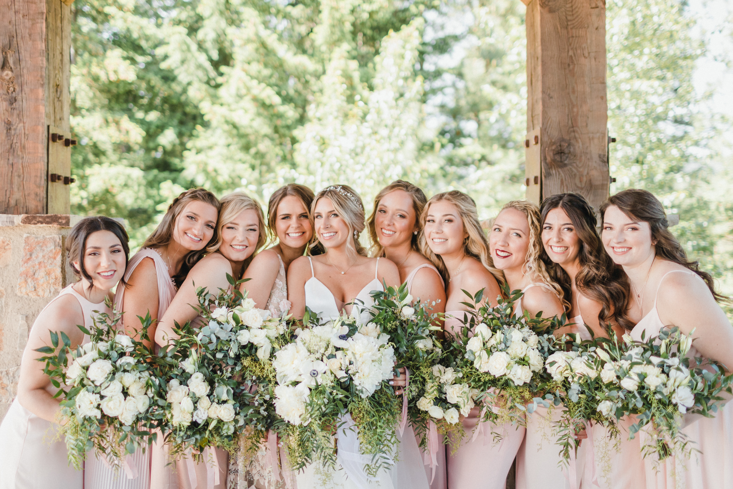
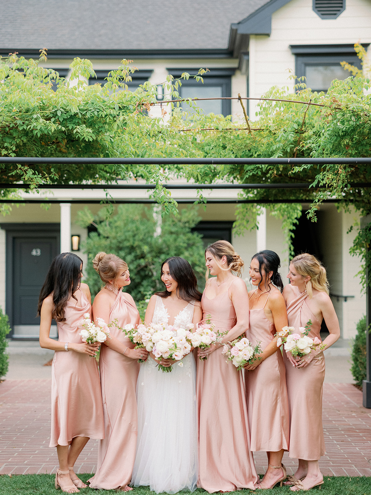
3. Keep Skin Tones in Mind
Your wedding party will be in a lot of photos. When choosing attire, consider how the colors will look on different skin tones. Soft colors like sage, mauve, or dusty lavender tend to be universally flattering and create a beautiful, consistent look in portraits.
Photographer Tip: Avoid shiny fabrics like satin in harsh sunlight—they can reflect light awkwardly and be hard to edit.
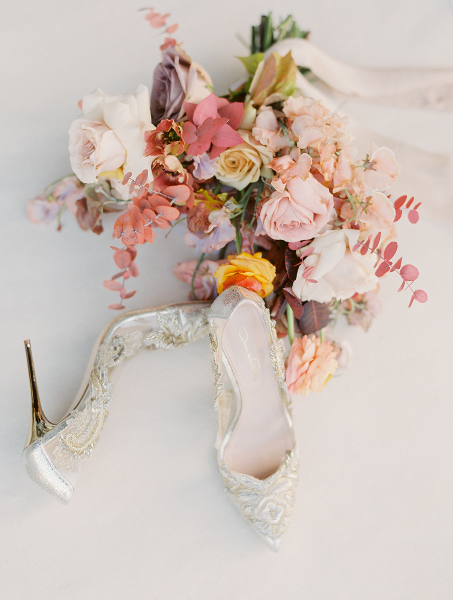
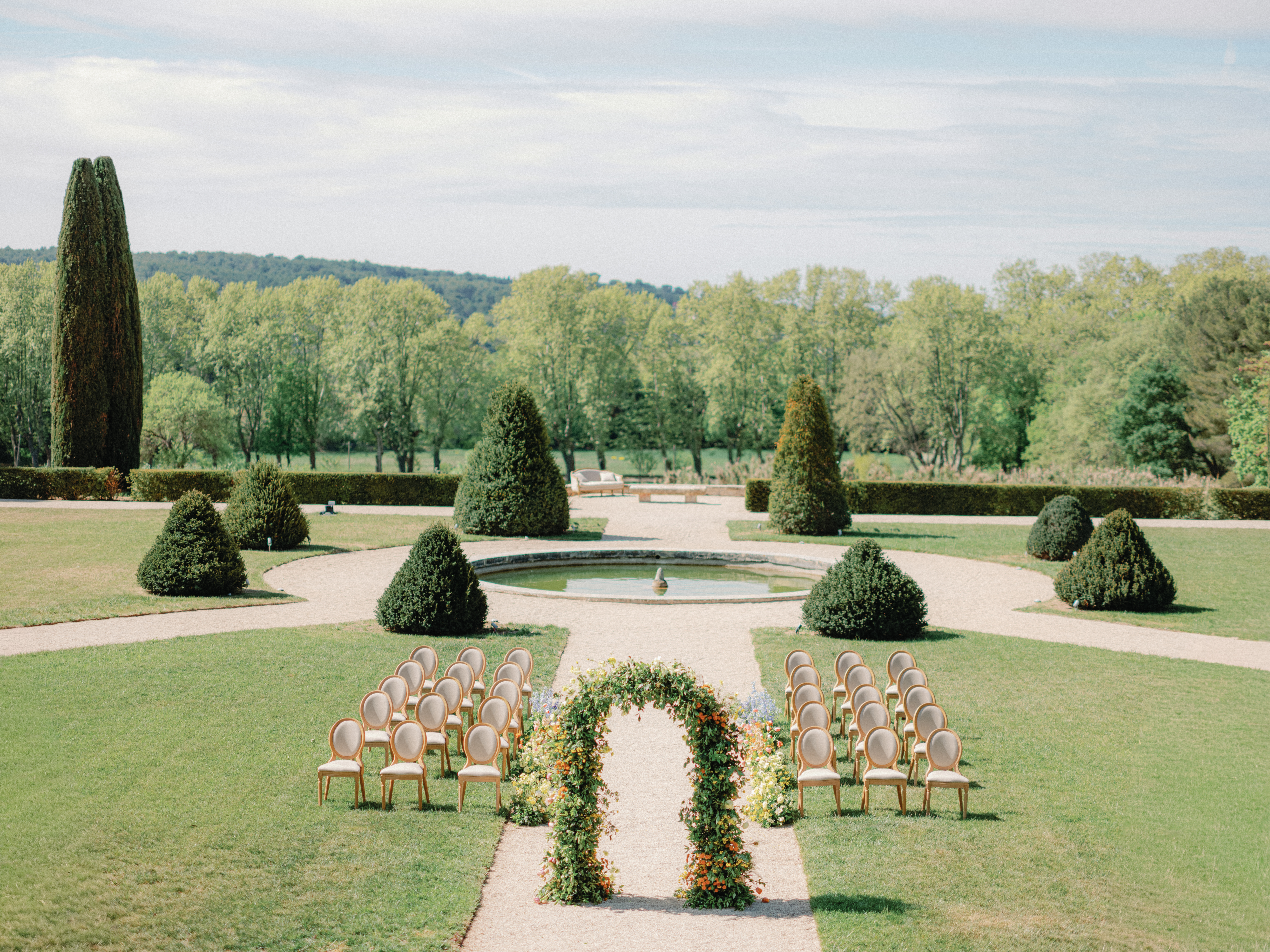
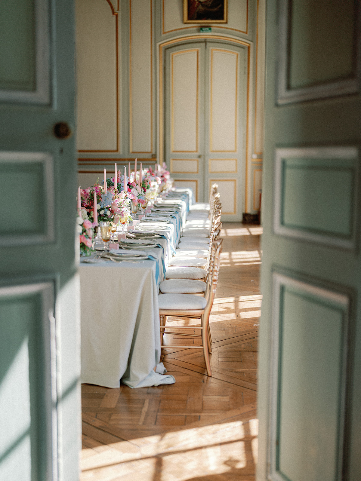
4. Don’t Forget About the Florals
Florals are often the “glue” that ties your color palette together. Your bouquet will be in almost every photo, so think of it as a focal point!
If you’re using neutrals for attire, you can incorporate a pop of color with flowers—think blush, dusty coral, or muted plum. If your colors are already bold, keep florals softer to avoid clashing.
Real Wedding Example: At a Seattle wedding at Lairmont Manor, the couple chose soft spring inspired pastel colors for their floral arrangements. The contrast was dreamy, and the natural light made the colors glow.
5. Think About Your Venue & Surroundings
A bright fuchsia may look fun on Pinterest, but it might clash with a rustic barn or a historic estate’s architecture. Let your venue inspire your palette.
- Outdoor/mountain venues: Earth tones, greens, creams, dusty rose
- Urban/downtown settings: Black, slate blue, crisp white, metallics
- Classic venues: Navy, gold, burgundy, soft pink
6. Limit Your Palette to 3-5 Key Colors
Less is more when it comes to color. Too many competing shades can make your photos look cluttered and busy.
Ideal combo: One main color, a secondary tone, and a few accent neutrals. This gives your photographer and planner enough flexibility to create a visually cohesive look across florals, attire, paper goods, and decor.

When choosing your wedding color palette for photography, think of how your colors will live beyond your wedding day—in prints, albums, and framed portraits. A great photographer can make any color look beautiful, but starting with thoughtful, photo-friendly tones makes all the difference.
Still need help planning your photo-perfect wedding color scheme? I’m happy to guide you during our consultation and make recommendations based on your venue, season, and personal style.


add a comment
+ COMMENTS